InputStyle
Description
InputComponents often need be able to stand out, alerting the user that a potential action is required by them. Thus, styling them is crucial.
UCGUI applies the native Default style when an InputComponent is created.
It styles both the user-text and placeholder with the Primary and Secondary TextStyle respectively, as well as turning down the alpha of the placeholder.
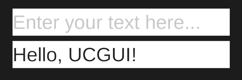
This leads to a very simple looking input field, waiting for you to be customized to your needs.
tip
You can directly override the Default style, removing the need to manually call .Style() every time you
create an InputComponent. You can do this by redefining it.
Implementation
note